// Home page sections — Apple-grade editorial rhythm over the XOCO brand.
// Intro · EventTypes (bento) · FeatureBand · SpacesPreview · Quote.

function Intro() {
  const blocks = [
    ['Versatility', 'A versatile, open-concept venue with a customizable floor plan designed to accommodate any celebration—from weddings and quinceañeras to birthdays, anniversaries, corporate events, and special gatherings. Transform the space to match your vision and bring your creativity and imagination to life.'],
    ['Atmosphere', 'Where rustic-modern charm meets timeless elegance. Whether your style is sophisticated or simple, our versatile space allows you to tailor every detail and bring your dream celebration to life—creating unforgettable memories that will last a lifetime.'],
    ['Setting', 'Artful natural light and artwork create a distinctive setting that inspires conversation, connection, and celebration. The fusion of art and architecture provides a sophisticated yet welcoming atmosphere.'],
  ];
  return (
    <section className="section" id="intro" data-screen-label="Intro">
      <div className="wrap-narrow chapter reveal">
        <div className="kicker">Discover Xoco House Gallery</div>
        <h2 className="headline lg">Your celebration, your vision.</h2>
        <div className="intro-blocks">
          {blocks.map(([tag, text], i) => (
            <div className="intro-block reveal" key={tag} style={{ '--reveal-delay': (i * 90) + 'ms' }}>
              <span className="intro-block-tag">{tag}</span>
              <p className="lede">{text}</p>
            </div>
          ))}
        </div>
        <div className="link-row">
          <a className="clink" href="about.html">About the space</a>
          <a className="clink" href="amenities.html">Explore amenities</a>
        </div>
      </div>
      <div className="wrap">
        <figure className="intro-show reveal-img">
          <img src="assets/photos/hall-bright.webp" alt="A newlywed couple sharing a quiet moment amid their reception beneath the warm string lights" />
        </figure>
      </div>
      <style>{`
        .intro-show { margin: 84px 0 0; border-radius: var(--r-bento); overflow: hidden; aspect-ratio: 16/8; background: var(--xh-sand-200); }
        .intro-show img { width: 100%; height: 100%; object-fit: cover; }
        .intro-blocks { display: flex; flex-direction: column; gap: 30px; margin: 36px 0 36px; }
        .intro-block { border-left: 2px solid var(--accent); padding-left: 22px; }
        .intro-block-tag { display: block; font-size: 10.5px; font-weight: 600; letter-spacing: 0.22em; text-transform: uppercase; color: var(--accent); margin-bottom: 10px; }
        .intro-block .lede { margin: 0; }
        @media (max-width: 768px) { .intro-show { margin-top: 52px; aspect-ratio: 4/3; } }
      `}</style>
    </section>
  );
}

function EventTypes() {
  const cards = [
    { cls: 'col-3 row-2 tall', src: 'assets/photos/wedding-dance.webp', n: 'Weddings',
      d: 'A grand entrance and open loft dressed in light — ceremonies and first dances made for the room.' },
    { cls: 'col-3', src: 'assets/photos/quince-pink.webp', n: 'Quinceañeras',
      d: 'A once-in-a-lifetime celebration, styled exactly as she imagined it.' },
    { cls: 'col-3', src: 'assets/photos/mingling.webp', n: 'Corporate & Socials',
      d: 'Launches, dinners and mixers within a refined, endlessly configurable floor plan.' },
    { cls: 'col-6 short', src: 'assets/photos/bar.webp', n: 'Cocktails & Receptions',
      d: 'Intimate gatherings wrapped in a relaxed, art-filled gallery atmosphere.' },
  ];
  return (
    <section className="section evt-sec" data-screen-label="Event Types">
      <div className="wrap">
        <div className="chapter reveal" style={{ marginBottom: 64 }}>
          <div className="kicker">What We Host</div>
          <h2 className="headline lg">One space, endlessly versatile.</h2>
          <p className="lede">
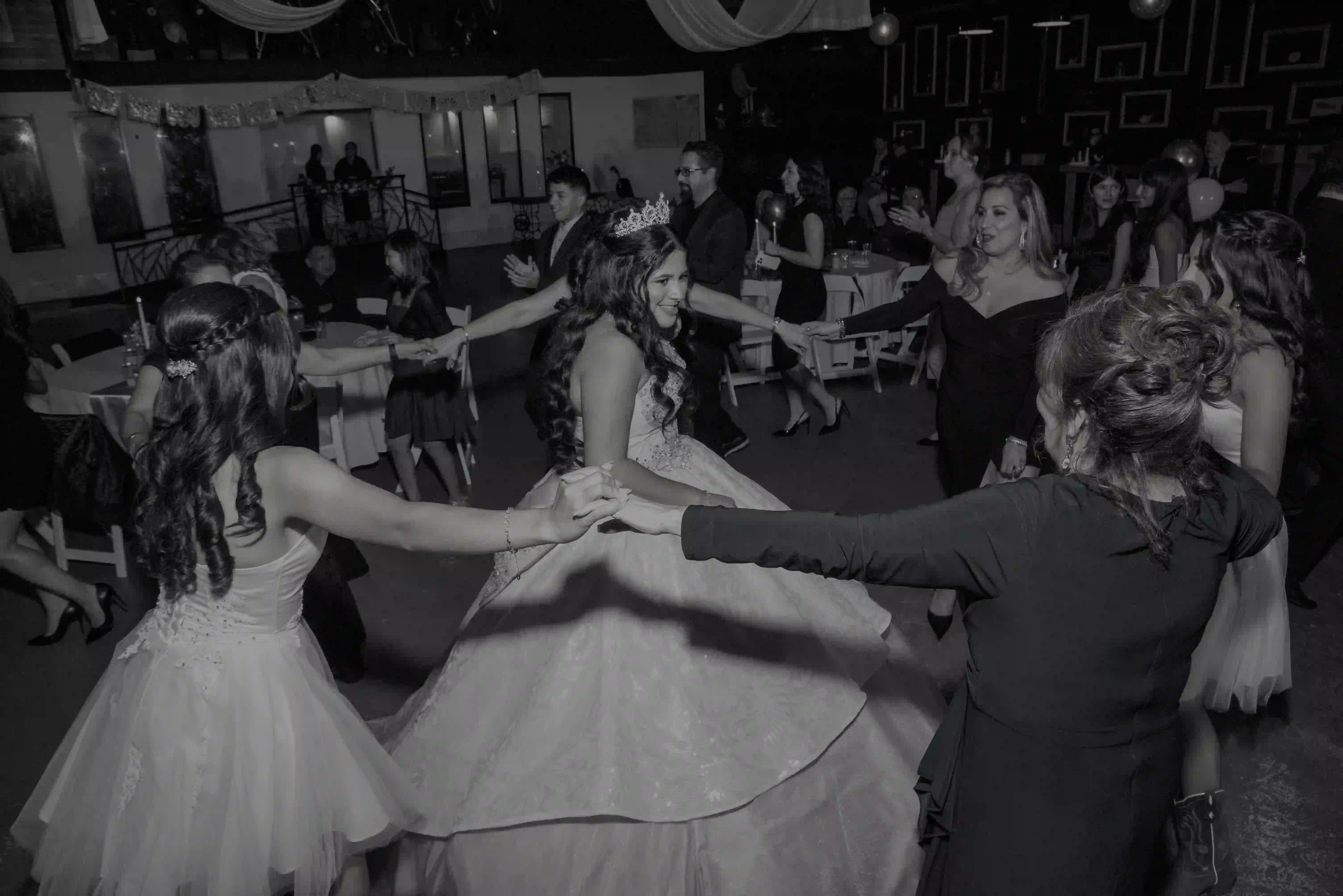
From the grandest celebration to the most intimate gathering — the room reconfigures around your vision.</p>
        </div>
        <div className="bento">
          {cards.map((c, i) => (
            <article className={'bento-card bento-scrim reveal ' + c.cls} key={c.n} style={{ '--reveal-delay': (i * 90) + 'ms' }}>
              <div className="bento-media"><img src={c.src} alt={c.n} /></div>
              <div className="bento-body">
                <span className="bento-eyebrow">{'0' + (i + 1)}</span>
                <h3 className="bento-title">{c.n}</h3>
                <p className="bento-sub">{c.d}</p>
              </div>
            </article>
          ))}
        </div>
      </div>
      <style>{`
        .evt-sec { background: var(--xh-bone); }
      `}</style>
    </section>
  );
}

function FeatureBand() {
  return (
    <section className="fband" data-screen-label="Feature Band">
      <div className="fband-media reveal-img">
        <img src="assets/photos/wedding-ceremony.webp" alt="A wedding ceremony underway, the couple at the altar framed by their wedding party" />
      </div>
      <div className="fband-scrim"></div>
      <div className="wrap fband-inner reveal">
        <div className="kicker on-dark">An Open Canvas</div>
        <h2 className="headline lg on-dark fband-title">Your celebration, exactly as you imagine it.</h2>
        <p className="lede on-dark fband-p">
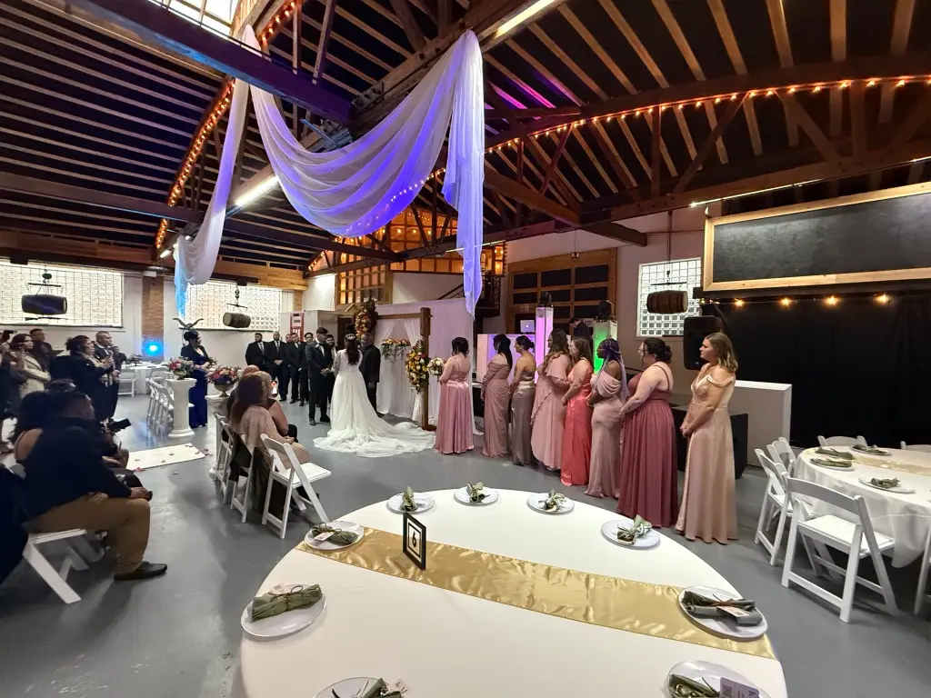
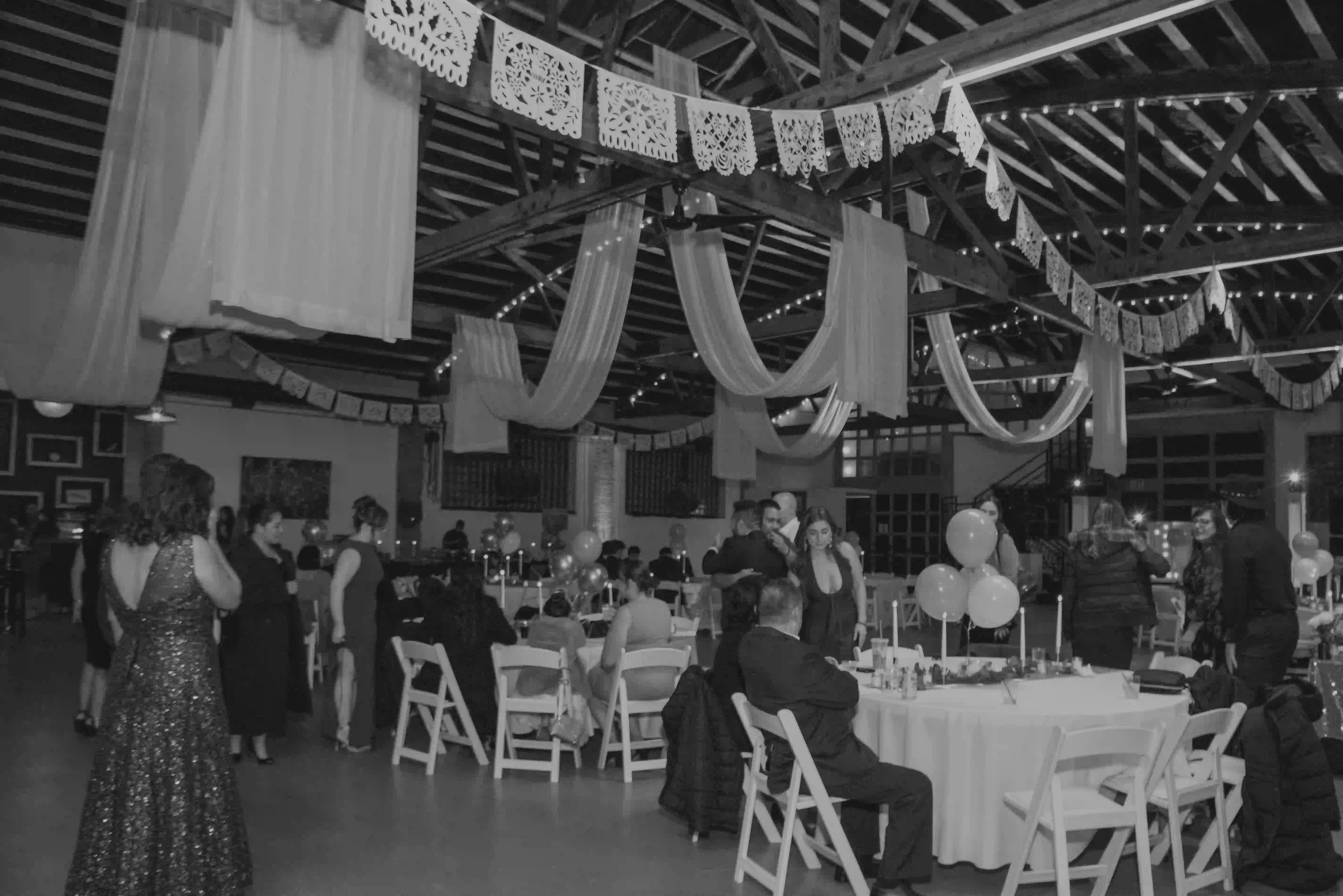
Soaring trusses, skylights and an uninterrupted floor plan make Xoco House Gallery
          as fitting for a wedding ceremony as it is for a milestone celebration.</p>
        <div className="link-row">
          <a className="pill pill-glass" href="amenities.html">Explore Amenities</a>
          <a className="clink on-dark" href="gallery.html">See the gallery</a>
        </div>
      </div>
      <style>{`
        .fband { position: relative; isolation: isolate; min-height: 92vh; display: flex; align-items: center; color: var(--xh-bone); overflow: hidden; }
        .fband-media { position: absolute; inset: 0; z-index: -1; }
        .fband-media img { width: 100%; height: 100%; object-fit: cover; }
        .fband-scrim { position: absolute; inset: 0; pointer-events: none;
          background: linear-gradient(90deg, rgba(18,16,14,0.8) 0%, rgba(18,16,14,0.4) 56%, rgba(18,16,14,0.12) 100%); }
        .fband-inner { position: relative; display: flex; flex-direction: column; align-items: flex-start; gap: 22px; }
        .fband-title { max-width: 16ch; }
        .fband-p { max-width: 44ch; }
        @media (max-width: 600px) { .fband { min-height: 80vh; } }
      `}</style>
    </section>
  );
}

function SpacesPreview() {
  return (
    <section className="section sp-sec" data-screen-label="Spaces Preview">
      <div className="wrap">
        <div className="sp-head reveal">
          <div>
            <div className="kicker">A Look Inside</div>
            <h2 className="headline lg">Made for the people in the room.</h2>
          </div>
          <a className="clink" href="gallery.html">View full gallery</a>
        </div>
        <div className="sp-grid">
          <figure className="sp-a reveal-img"><img src="assets/photos/quince-family.webp" alt="A quinceañera and her family gathered together on the gallery's iron staircase" /></figure>
          <figure className="sp-b reveal-img" style={{ '--reveal-delay': '90ms' }}><img src="assets/photos/quince-dance.webp" alt="Guests circling the quinceañera on the dance floor" /></figure>
          <figure className="sp-c reveal-img" style={{ '--reveal-delay': '180ms' }}><img src="assets/photos/reception-bw.webp" alt="A full reception under papel picado and string lights" /></figure>
        </div>
      </div>
      <style>{`
        .sp-sec { background: var(--xh-bone); }
        .sp-head { display: flex; justify-content: space-between; align-items: flex-end; gap: 24px; flex-wrap: wrap; margin-bottom: 48px; }
        .sp-grid { display: grid; grid-template-columns: 1.5fr 1fr; grid-template-rows: 1fr 1fr; gap: 20px; }
        .sp-grid figure { margin: 0; border-radius: var(--r-bento); overflow: hidden; background: var(--xh-sand-200); }
        .sp-grid figure img { width: 100%; height: 100%; object-fit: cover; }
        .sp-a { grid-row: span 2; min-height: 560px; }
        .sp-b, .sp-c { min-height: 270px; }
        @media (max-width: 768px) { .sp-grid { grid-template-columns: 1fr 1fr; grid-template-rows: auto; }
          .sp-a { grid-column: span 2; grid-row: auto; min-height: 320px; } .sp-b, .sp-c { min-height: 220px; } }
      `}</style>
    </section>
  );
}

function Quote() {
  return (
    <section className="section quote-sec" data-screen-label="Quote">
      <div className="wrap-narrow quote-wrap reveal">
        <div className="kicker on-dark">From Our Hosts</div>
        <blockquote className="headline md on-dark quote-q">&ldquo;Our guests are still talking about the room.
          Every celebration here feels like it was made for this space.&rdquo;</blockquote>
        <div className="quote-by">A recent celebration at Xoco House Gallery</div>
      </div>
      <style>{`
        .quote-sec { background: var(--xh-ink-900); }
        .quote-wrap { text-align: center; display: flex; flex-direction: column; align-items: center; gap: 26px; }
        .quote-q { font-style: italic; line-height: 1.32; max-width: 22ch; }
        .quote-by { font-size: 11px; letter-spacing: 0.26em; text-transform: uppercase; color: rgba(249,248,246,0.55); }
      `}</style>
    </section>
  );
}

Object.assign(window, { Intro, EventTypes, SpacesPreview, FeatureBand, Quote });
