// Amenities page sections.
function AmenitiesGrid() {
  const items = [
    ['Open floor plan', 'An uninterrupted, customizable layout that reconfigures for ceremonies, dinners and receptions.'],
    ['Natural light', 'Skylights and tall windows wash the room in soft, changing daylight throughout the day.'],
    ['Soaring ceilings', 'Exposed timber trusses and generous height give the space a grand, airy presence.'],
    ['Gallery walls', 'Bright, bone-white walls ready for art, signage, projection or simply room to breathe.'],
    ['Modern facilities', 'Thoughtful lighting, sound-ready infrastructure and contemporary back-of-house amenities.'],
    ['Vintage character', 'Brick, plaster and reclaimed wood lend a warm, rustic soul to a contemporary loft.'],
  ];
  return (
    <section className="section" data-screen-label="Amenities Grid">
      <div className="container">
        <div className="section-head">
          <div className="eyebrow">The Essentials</div>
          <h2 className="serif section-title">Everything your event needs.</h2>
        </div>
        <div className="am-grid">
          {items.map(([t, d]) => (
            <div className="am-item" key={t}>
              <span className="am-dot"></span>
              <h3 className="serif am-t">{t}</h3>
              <p className="am-d">{d}</p>
            </div>
          ))}
        </div>
      </div>
      <style>{`
        .am-grid { display: grid; grid-template-columns: repeat(3, 1fr); gap: 1px; background: var(--border-soft); border: 1px solid var(--border-soft); }
        .am-item { background: var(--xh-bone); padding: 38px 32px 42px; }
        .am-dot { display: block; width: 9px; height: 9px; background: var(--accent); margin-bottom: 22px; }
        .am-t { font-size: 22px; margin: 0 0 10px; color: var(--fg); }
        .am-d { font-size: 14.5px; line-height: 1.72; color: var(--fg-2); margin: 0; }
        @media (max-width: 860px) { .am-grid { grid-template-columns: 1fr 1fr; } }
        @media (max-width: 560px) { .am-grid { grid-template-columns: 1fr; } }
      `}</style>
    </section>
  );
}

function LoungeFeature() {
  const amenities = ['Comfortable seating', 'Soft lighting', 'Refreshment station', 'Private restroom access', 'Mirrors', 'Wi-Fi'];
  return (
    <section className="section tight lounge-sec" data-screen-label="Private Lounge">
      <div className="container lounge-grid">
        <div className="lounge-media">
          <img src="assets/photos/mingling.webp" alt="Guests mingling with drinks in the art-filled private lounge" />
        </div>
        <div className="lounge-text">
          <div className="eyebrow">The Private Lounge</div>
          <hr className="rule" style={{ margin: '20px 0 26px' }} />
          <h2 className="serif section-title" style={{ maxWidth: '16ch' }}>A quiet, stylish retreat within the venue.</h2>
          <p>
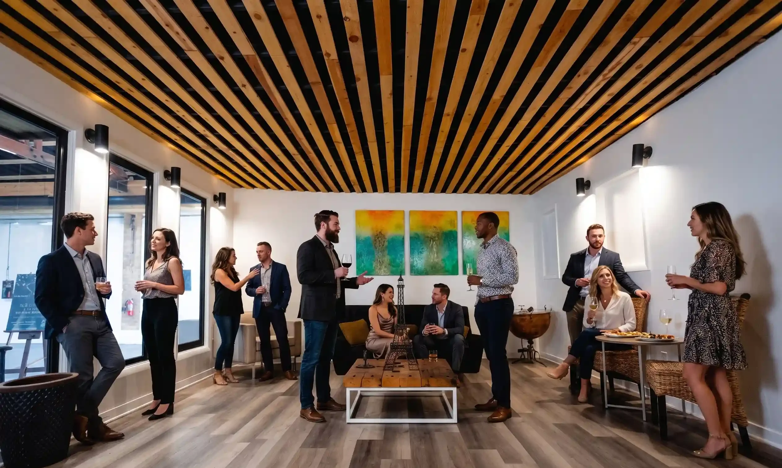
A calm space to gather away from the main room — perfect for getting ready, hosting
            close guests, or simply taking a moment. Whether you&rsquo;re preparing for a big moment
            or stepping back from it, the lounge offers privacy and comfort to elevate your
            experience.</p>
          <ul className="amen">
            {amenities.map(a => <li key={a}>{a}</li>)}
          </ul>
        </div>
      </div>
      <style>{`
        .lounge-sec { background: var(--xh-sand-100); }
        .lounge-grid { display: grid; grid-template-columns: 1.05fr 0.95fr; gap: 64px; align-items: center; }
        .lounge-media { aspect-ratio: 5/4; overflow: hidden; background: var(--xh-sand-200); border-radius: var(--r-bento); }
        .lounge-media img { width: 100%; height: 100%; object-fit: cover; }
        .lounge-text p { font-size: 16px; line-height: 1.78; color: var(--fg-2); margin: 24px 0 30px; max-width: 44ch; }
        .amen { list-style: none; margin: 0; padding: 0; display: grid; grid-template-columns: 1fr 1fr; gap: 14px 28px; }
        .amen li { font-size: 14.5px; color: var(--fg); padding-left: 20px; position: relative; }
        .amen li::before { content:''; position:absolute; left:0; top:8px; width:7px; height:7px; background: var(--accent); }
        @media (max-width: 860px) { .lounge-grid { grid-template-columns: 1fr; gap: 32px; } }
      `}</style>
    </section>
  );
}

function AmenitiesStrip() {
  const imgs = [
    ['assets/photos/bar.webp', 'Cocktails and conversation at the gallery bar'],
    ['assets/photos/quince-pink.webp', 'A quinceañera reception styled in blush and gold'],
    ['assets/photos/quince-portrait.webp', 'A quinceañera beside her lit “15” marquee'],
  ];
  return (
    <section className="section" data-screen-label="Amenities Strip">
      <div className="container">
        <div className="strip-grid">
          {imgs.map(([src, alt]) => (
            <figure className="strip-tile" key={src}>
              <img src={src} alt={alt} />
            </figure>
          ))}
        </div>
      </div>
      <style>{`
        .strip-grid { display: grid; grid-template-columns: repeat(3, 1fr); gap: 16px; }
        .strip-tile { margin: 0; aspect-ratio: 3/4; overflow: hidden; background: var(--xh-sand-200); border-radius: var(--r-bento); }
        .strip-tile img { width: 100%; height: 100%; object-fit: cover; transition: transform 600ms var(--ease-out); }
        .strip-tile:hover img { transform: scale(1.04); }
        @media (max-width: 860px) { .strip-grid { grid-template-columns: 1fr 1fr; } .strip-tile:last-child { grid-column: span 2; aspect-ratio: 16/9; } }
      `}</style>
    </section>
  );
}

Object.assign(window, { AmenitiesGrid, LoungeFeature, AmenitiesStrip });
