// About Us page sections.
function AboutStory() {
  return (
    <section className="section" data-screen-label="About Story">
      <div className="container about-grid">
        <div className="about-copy">
          <div className="eyebrow">Our Story</div>
          <hr className="rule" style={{ margin: '20px 0 28px' }} />
          <h2 className="serif section-title" style={{ maxWidth: '15ch' }}>A gallery where art and celebration meet.
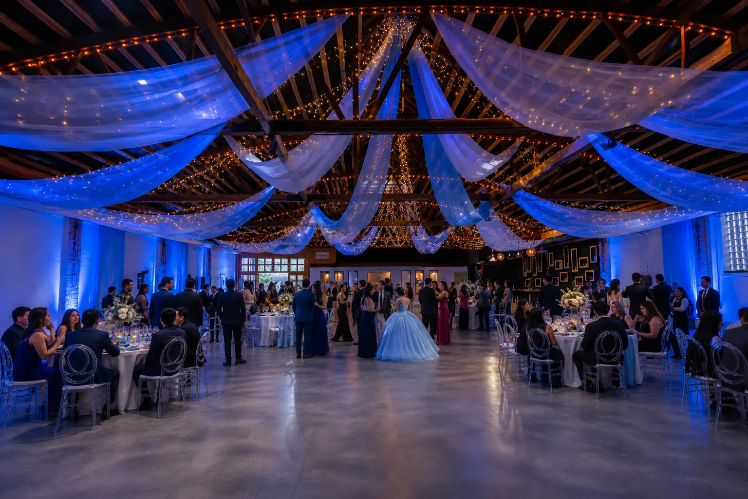
</h2>
          <p>Tucked into one of Chicago&rsquo;s most artistic neighborhoods, Xoco House Gallery began
            with a simple belief — that the right room can turn a gathering into a memory. Inside a
            light-filled loft of timber, brick and plaster, we built a space as suited to a wedding
            as it is to an exhibition.</p>
          <p>The result is a refined, gallery-style venue with an open floor plan, soaring ceilings
            and remarkable versatility. Sculpture and contemporary art live alongside the everyday
            life of the room, lending every event an unmistakable sense of creativity and warmth.</p>
        </div>
        <div className="about-media">
          <img src="assets/photos/quince-family.webp" alt="A quinceañera and her family gathered together at Xoco House Gallery" />
        </div>
      </div>
      <style>{`
        .about-grid { display: grid; grid-template-columns: 1.05fr 0.95fr; gap: 64px; align-items: center; }
        .about-copy p { font-size: 16.5px; line-height: 1.78; color: var(--fg-2); margin: 22px 0 0; max-width: 46ch; }
        .about-media { aspect-ratio: 4/5; overflow: hidden; background: var(--xh-sand-200); border-radius: var(--r-bento); }
        .about-media img { width: 100%; height: 100%; object-fit: cover; }
        @media (max-width: 860px) { .about-grid { grid-template-columns: 1fr; gap: 36px; } .about-media { aspect-ratio: 16/10; } }
      `}</style>
    </section>
  );
}

function AboutValues() {
  const vals = [
    ['Artful', 'A working gallery atmosphere — bright walls, natural light and a rotating sense of creativity throughout the space.'],
    ['Versatile', 'An open, customizable floor plan that adapts to seated dinners, ceremonies, receptions and showings alike.'],
    ['Warm', 'Rustic textures and a vintage soul give a contemporary loft an inviting, unmistakably human feel.'],
  ];
  return (
    <section className="section tight vals-sec" data-screen-label="About Values">
      <div className="container">
        <div className="section-head center">
          <div className="eyebrow">What Sets Us Apart</div>
          <h2 className="serif section-title">Considered in every detail.</h2>
        </div>
        <div className="vals-grid">
          {vals.map(([t, d], i) => (
            <div className="val" key={t}>
              <span className="val-n serif">{'0' + (i + 1)}</span>
              <h3 className="serif val-t">{t}</h3>
              <p className="val-d">{d}</p>
            </div>
          ))}
        </div>
        <div className="vals-cta">
          <p className="vals-cta-p">Ready to start planning? Call us at <a href="tel:+16306647283" className="vals-phone">(630) 664-7283</a> or <a className="clink" href="contact.html">send us a message</a>.</p>
        </div>
      </div>
      <style>{`
        .vals-sec { background: var(--xh-bone); }
        .vals-grid { display: grid; grid-template-columns: repeat(3, 1fr); gap: 28px; }
        .val { background: var(--xh-white); border: 1px solid var(--border-soft); padding: 40px 34px 44px; box-shadow: var(--shadow-sm); }
        .val-n { display: block; font-size: 15px; color: var(--accent); letter-spacing: 0.1em; margin-bottom: 16px; }
        .val-t { font-size: 26px; margin: 0 0 12px; color: var(--fg); }
        .val-d { font-size: 15px; line-height: 1.72; color: var(--fg-2); margin: 0; }
        .vals-cta { margin-top: 48px; text-align: center; }
        .vals-cta-p { font-size: 17px; line-height: 1.6; color: var(--fg-2); margin: 0; }
        .vals-phone { color: var(--accent); font-weight: 500; text-decoration: none; }
        .vals-phone:hover { text-decoration: underline; }
        @media (max-width: 860px) { .vals-grid { grid-template-columns: 1fr; } }
      `}</style>
    </section>
  );
}

function AboutBand() {
  return (
    <section className="aband" data-screen-label="About Band">
      <img src="assets/photos/banner.webp" alt="Guests celebrating beneath the draped, light-strung ceiling of the main room" />
      <div className="aband-scrim"></div>
      <div className="container aband-inner">
        <blockquote className="serif aband-quote">&ldquo;A truly unique event experience — designed
          with both beauty and functionality in mind.&rdquo;</blockquote>
        <a className="btn btn-primary" href="contact.html">Plan Your Visit</a>
      </div>
      <style>{`
        .aband { position: relative; min-height: 64vh; display: flex; align-items: center; color: var(--xh-bone); overflow: hidden; text-align: center; }
        .aband img { position: absolute; inset: 0; width: 100%; height: 100%; object-fit: cover; }
        .aband-scrim { position: absolute; inset: 0; background: rgba(18,16,14,0.6); }
        .aband-inner { position: relative; display: flex; flex-direction: column; align-items: center; gap: 32px; }
        .aband-quote { font-size: clamp(1.6rem, 3.4vw, 2.8rem); line-height: 1.3; font-style: italic; margin: 0; max-width: 22ch; color: var(--xh-bone); }
      `}</style>
    </section>
  );
}

Object.assign(window, { AboutStory, AboutValues, AboutBand });
